


The holiday season is upon us and there's no better way to practice than to do some themed mini-projects. This is the first tutorial in a series, where I'll outline small projects that you can take and make your own.
Let's create a switch to toggle between dark and light modes in jQuery. In honor of spooky season, we'll do it up with a little Halloween style. There's always multiple solutions to any coding problem. It's no different with dark/light mode toggles. This particular solution is created using jQuery, but you could easily recreate it using vanilla javascript or a preferred library or framework.
Things this project is practice for the following concepts:
- Toggle function in JQuery
- DOM manipulation
- Adding classes with JQuery
We'll go over the basic foundation of creating a toggle with HTML and CSS. Then we'll talk about a couple of options in jQuery to add functionality and add the effects we want.
Step 1: UI/UX
Before starting with code, let's think about the user flow and sketch out a concept, either by hand or using a program like Figma or Sketch.
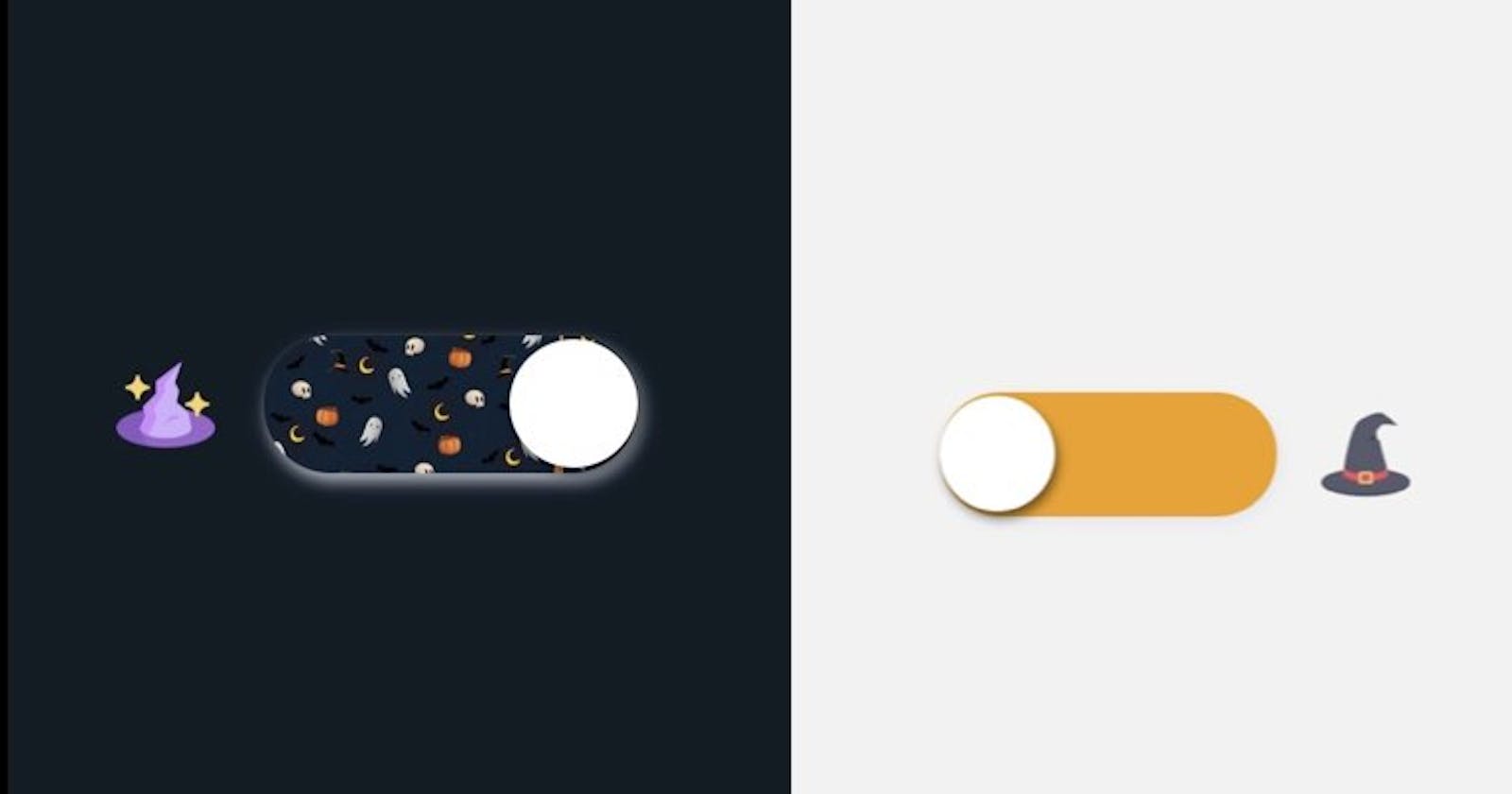
Users generally have a mental model for how a dark/light mode toggle will operate. For our purposes, this button will have very simple functionality and appear in a common format for light/dark modes. Since this is a Halloween-themed toggle, we'll make it festive, but with awareness of the existing mental model to keep it intuitive to use. In other words, we don't want to go all out with the styling to the point that users won't recognize what it's for.
Let's start with a plain toggle.
 We'll place icons on either end of the toggle to represent dark and light mode. I'm using a sorting hat for light mode and a witch hat for dark mode. If you're thinking to yourself, "I don't know what the h%ll a sorting hat is supposed to represent, and you just said we're trying not to confuse the user,"; you'd have a good point.
These icons might not be the most intuitive. Traditionally, the icons utilized for this use case are a sun and moon, or perhaps a lightbulb. In this case, we're attempting to be a little less basic and use the icons' placement to indicate how to use the toggle. A little creative license gives the user a surprise and makes it fun, which I think is appropriate for this, but this is your project, do you.
We'll place icons on either end of the toggle to represent dark and light mode. I'm using a sorting hat for light mode and a witch hat for dark mode. If you're thinking to yourself, "I don't know what the h%ll a sorting hat is supposed to represent, and you just said we're trying not to confuse the user,"; you'd have a good point.
These icons might not be the most intuitive. Traditionally, the icons utilized for this use case are a sun and moon, or perhaps a lightbulb. In this case, we're attempting to be a little less basic and use the icons' placement to indicate how to use the toggle. A little creative license gives the user a surprise and makes it fun, which I think is appropriate for this, but this is your project, do you.
Once the user clicks the toggle, let's change the styling of the toggle to indicate it's now in Halloween mode. Also, clicking on the toggle should queue the icon on the opposite side of the toggle to be visible while the current one becomes invisible. Lastly, clicking on the toggle should change the background color and any other elements we designate for the dark mode (aka Halloween mode). It should look like this.

Step 2: Psuedo Code
Now that we have the user flow mapped out, let's plan out our code. We're going to use HTML, CSS, and jQuery in this project. If we break down the code for each.
HTML
\\create toggle in html using checkbox
\\create icon elements (sorting hat, witches hat)
CSS
\\style the default background of the container element
\\style the input to create a toggle with CSS using pseudo-elements
\\style input when checked to set the background image of the toggle to indicate a change to Halloween
\\style slider button
\\style slider button with pseudo element ::before
\\create a Halloween class; this is a mode that we can toggle. When we toggle this class, we can go back and forth between regular and Halloween styling.
\\Animate input when checked + slider:before
####JS
\\Select the elements needed and assign to variables.
\\select container element use the toggle class function to toggle between regular (or light mode) and Halloween(or dark mode)
\\select sortingHat icon and use toggle class function to toggle the visibility; it should initially be set to not visible
\\select witchHat icon and use fadeToggle to simultaneously fade out the witchHat visibility, so only one icon is visible at a time
Code
Let's start with the foundation. There are a few main elements we need to set up. A container div and the icons to indicate dark and light modes. And we'll code a checkbox input element and take the classic shape of the toggle. A quick internet search will give you plenty of code examples for styling a checkbox to look like a toggle. The code should look something like this.
 <div id="container">
     <img src="https://bit.ly/3BHLseX" height="50px" id="sortingHat">
    <label class="switch">
      <input type="checkbox" name="input" id="checkBox"><span class="slider"></span>
    </label>
    <img src="https://cdn-icons-png.flaticon.com/512/3514/3514994.png" height="50px" id="witchHat">
</div>
The next step is to move on to the .css file. Here the goal is to style the elements, set up the initial mode, and set up a class for the dark mode that we'll later trigger with jQuery.
img{
  padding:25px;
}

#sortingHat{
  visibility:hidden;
}

#sortingHat.visible{
  visibility:visible;
  transition: .5s;
}

#container{
   height:100vh;
   display: flex;
   justify-content: center;
   align-items:center;
   background-color: #F2F2F0;
   transition: 1.5s all ease;
}

 #container.halloween{
    background-color:#111C26;
    transition: 1.5s ease all;
}


.switch{
        position: relative;
        display: inline-block;
        width: 190px;
        height: 70px;

    }

.switch input{
        opacity: 0;
        width: 0;
        height:0;
    }

.slider{
        position:absolute;
        cursor: pointer;
        border-radius: 34px;
        top: 0px;
        left: 0px;
        right:0px;
        bottom: 0px;
        background-color: #F29F05;
        -webkit-transition: .8s;
        transition: .8s;
        box-shadow: 2px 4px 8px rgba(222, 229, 241, 0.8);
    }

    .slider:before{
        position: absolute;
        content: " ";
        border-radius: 50%;
        cursor: pointer;
        height: 65px;
        width: 65px;
        top:2px;
        bottom:4px;
        background-color: white;
        -webkit-transition: .8s;
        transition: .8s;
        box-shadow: 2px 4px 6px rgba(0, 0, 0, 0.5);
    }

input:checked + .slider{
background-image: url(https://cdn.pixabay.com/photo/2020/09/23/19/58/halloween-5596921_1280.jpg;);
background-size:80%;
}

 input:checked + .slider:before{
       transform: translateX(125px);
       -webkit-transform: translateX(125px);
  }
JQuery
- Method 1: ** There are several ways to trigger the actions for dark and light mode, but this method searches for a change in the checkbox.
$(document).ready(function(){
$('#checkBox').change(function() {
   $('#container').toggleClass('halloween');
  $('#witchHat').fadeToggle();
  $('#sortingHat').toggleClass('visible');
  });
});
-Method 2:** Instead of selecting the input box, we can also select the document, like below. It's almost the exact same code.
$(document).ready(function(){
$(document).on("change","#checkBox",function() {
   $('#container').toggleClass('halloween');
  $('#witchHat').fadeToggle();
  $('#sortingHat').toggleClass('visible');
    });
});
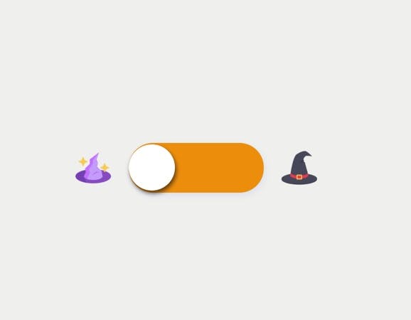
The finished product will look like this:
**Summary
This tutorial gives you the basics of setting up a toggle and triggering actions using jQuery statements. You can level this up by adding more detail to the style functions. For example, maybe add to the Halloween class, so it also changes the color and type of the font. In addition, you can add more jQuery statements within the input checked function, perhaps include an animation trigger.
If you're looking for more inspo, check out my instagram @followtheunnamedroad, where I post my projects regularly.